The Netters Social Club is a conceptual brand identity for a modern tennis and social club with locations across Los Angeles, San Francisco, Arizona, and Utah. Designed to bring people together on and off the court, Netters reimagines the traditional tennis club as a welcoming, community-driven destination for players of all levels.
Blending sport, culture, and lifestyle, the brand pairs a playful visual identity with a premium social experience. From the courts to the clubhouse, every touchpoint is designed to make tennis feel more accessible, connected, and fun.
Explore the official Netters playlist here!
Scope
— Art Direction
— Logo Identity
— Type & Color
— Illustration and Design System
— Editorial Design & Layout
— Collateral: Ads, Posters, Rack Cards
Creative Direction: Deja Brown
—
Design: Deja Brown
——
Copy: Deja Brown
——
Client: Concept Project
Naming & VISUAL IDENTITY | Meet the brand
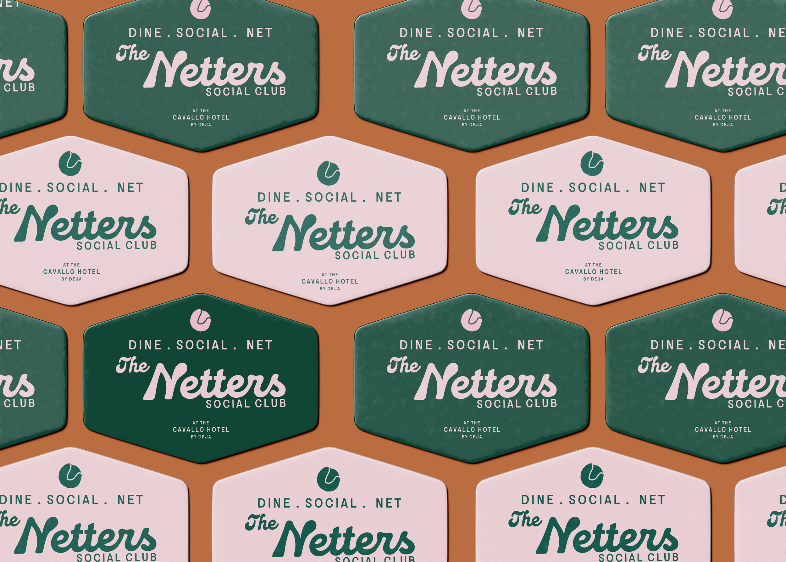
With the brand's purpose established, I moved into naming and visual identity development. Inspired by the nostalgia of vintage tennis clubs and the atmosphere of a retro Los Angeles social lounge, Netters was designed to feel both familiar and fresh.
The creative direction centered on a balance: creating a club experience that feels exclusive once you're inside, while communicating an inviting, inclusive atmosphere from the outside. The color palette draws from the warmth and sophistication of a modern social lounge, giving the brand a more cultured, contemporary take on traditional tennis culture.
LOGO
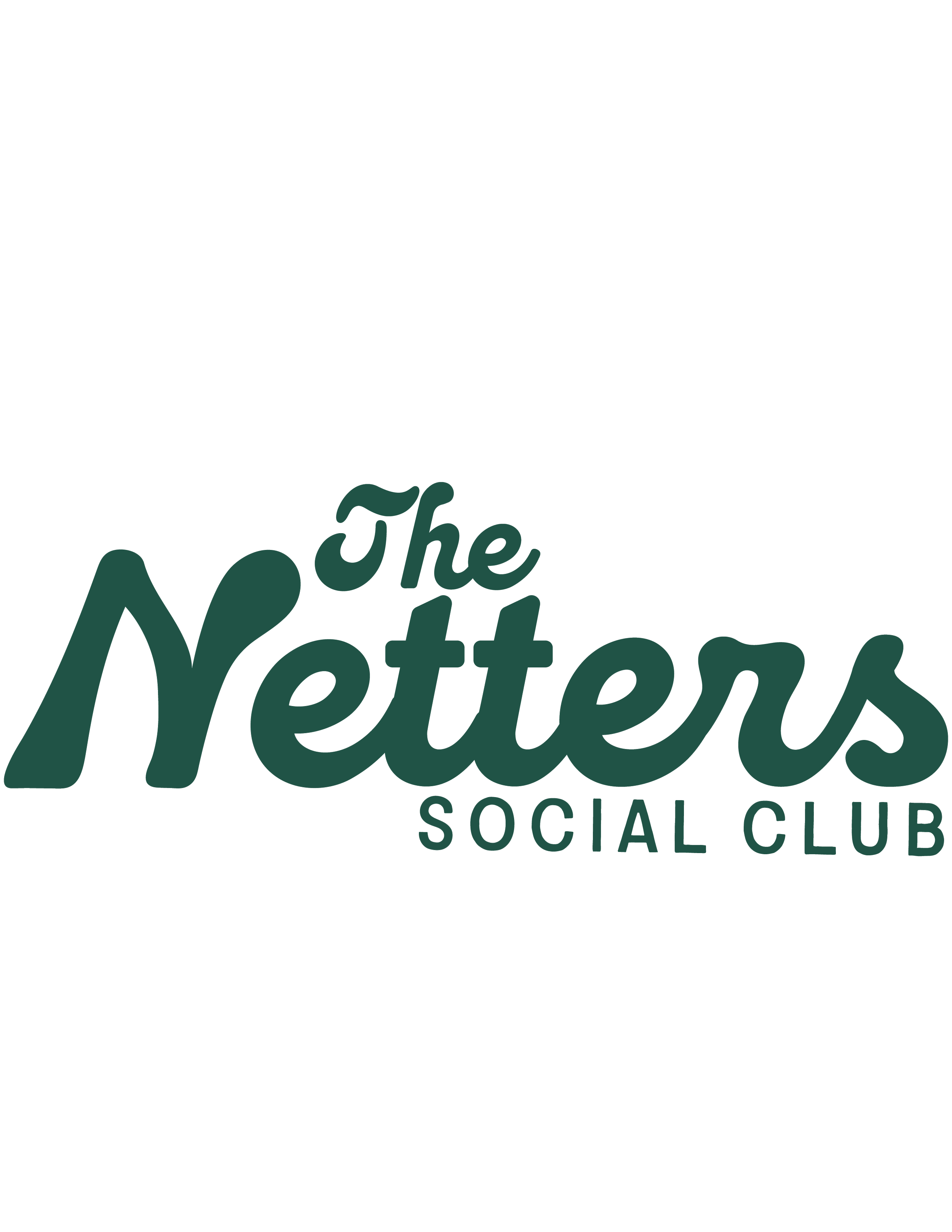
Primary
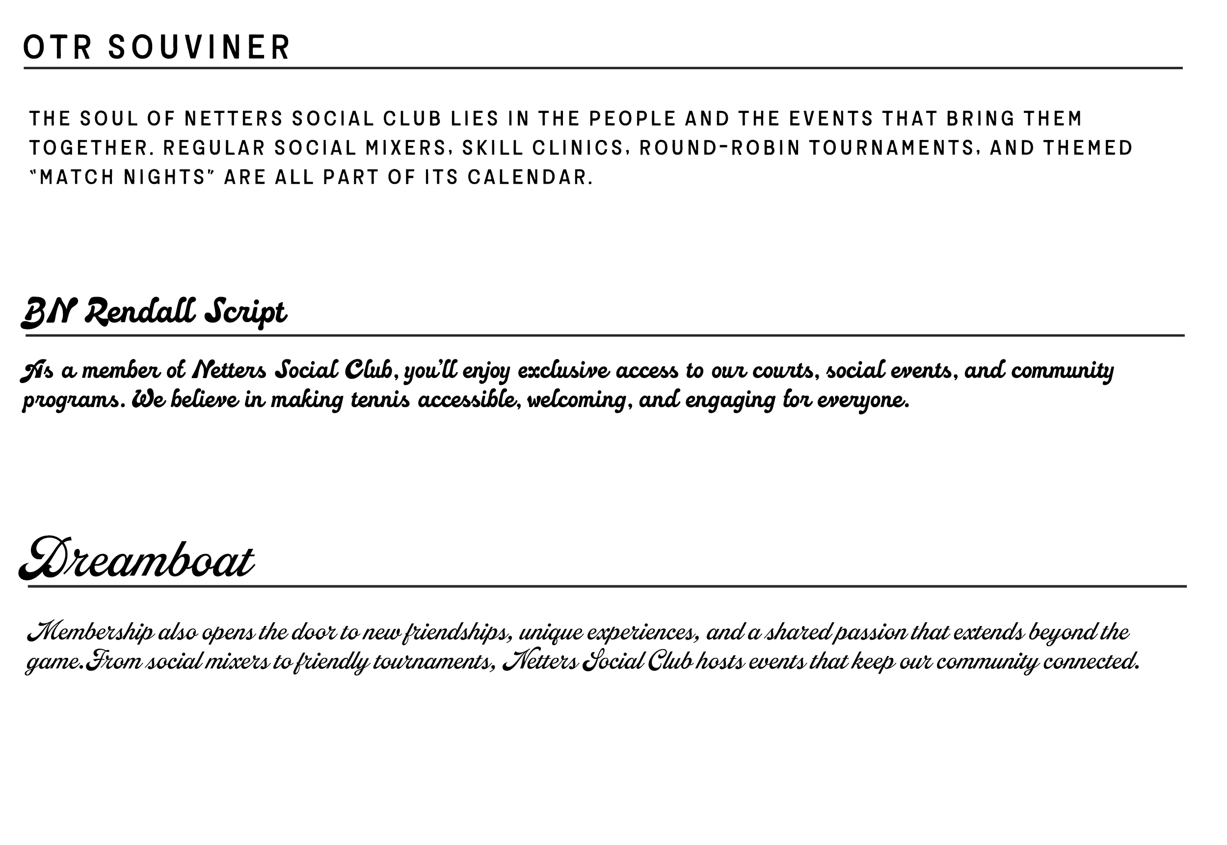
TYPOGRAPHY –
Three fonts define the visual identity of The Netters:
Three typefaces come together to give Netters its distinct personality, balancing vintage charm with modern character.
1. Souvenir Jacket - Drawn by hand to capture that vintage aesthetic with a modern edge; a sans serif typeface, for titles or body text.
2. BN Rendall Script- A bold script typeface used for logo and display purposes.
3. Dreamboat- A bold script used sparsely for personality
Enviormental Settings
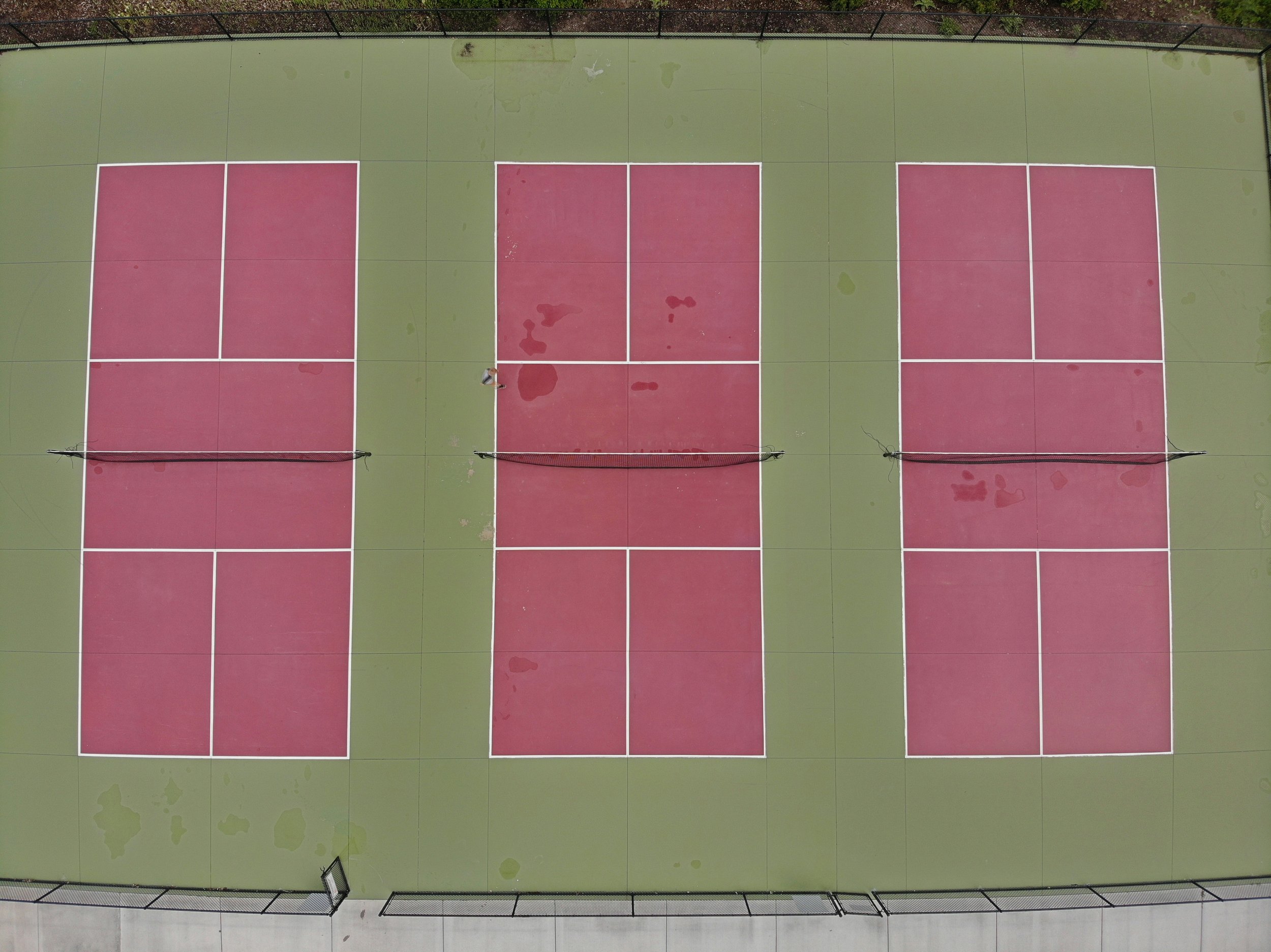
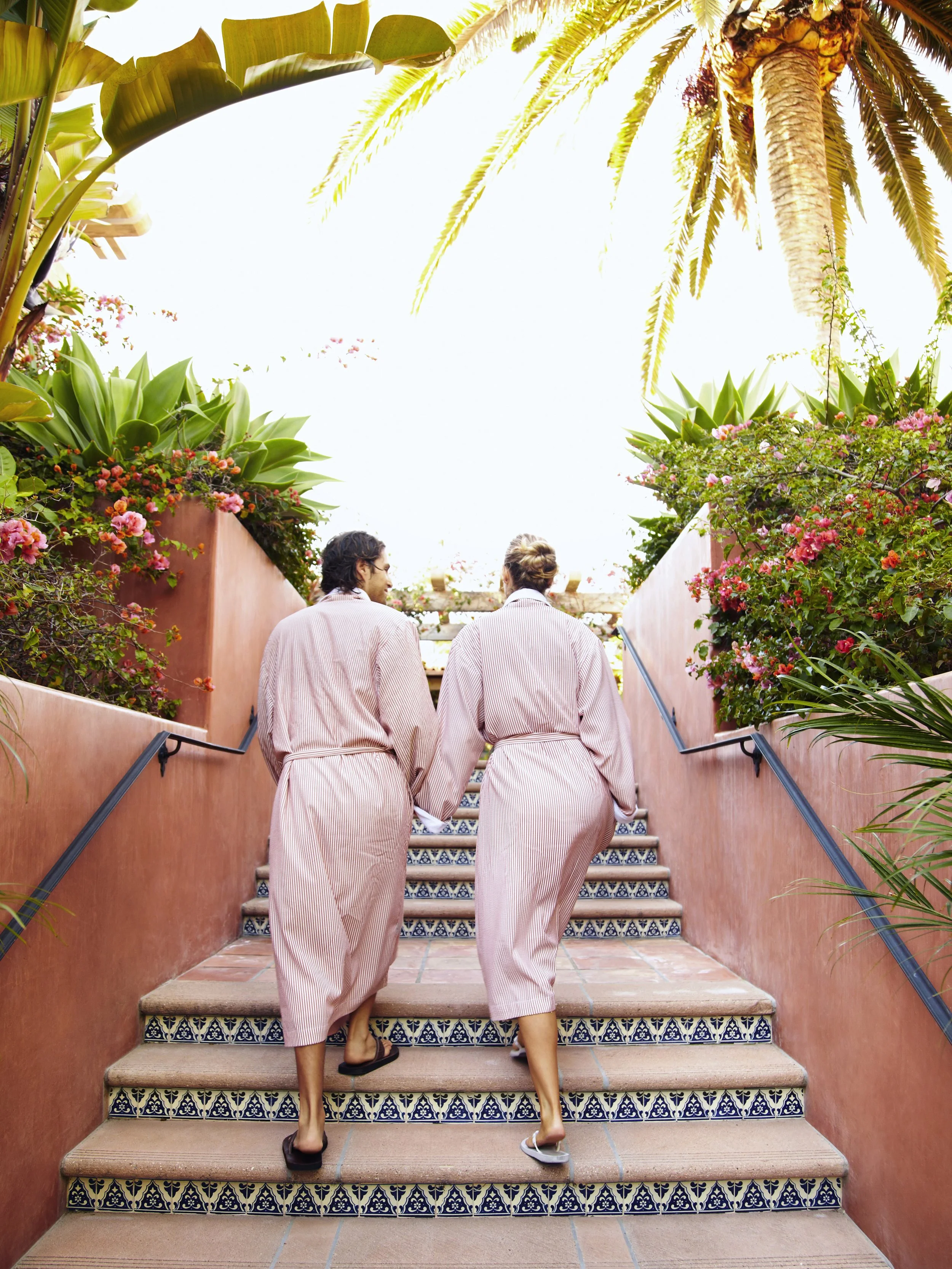
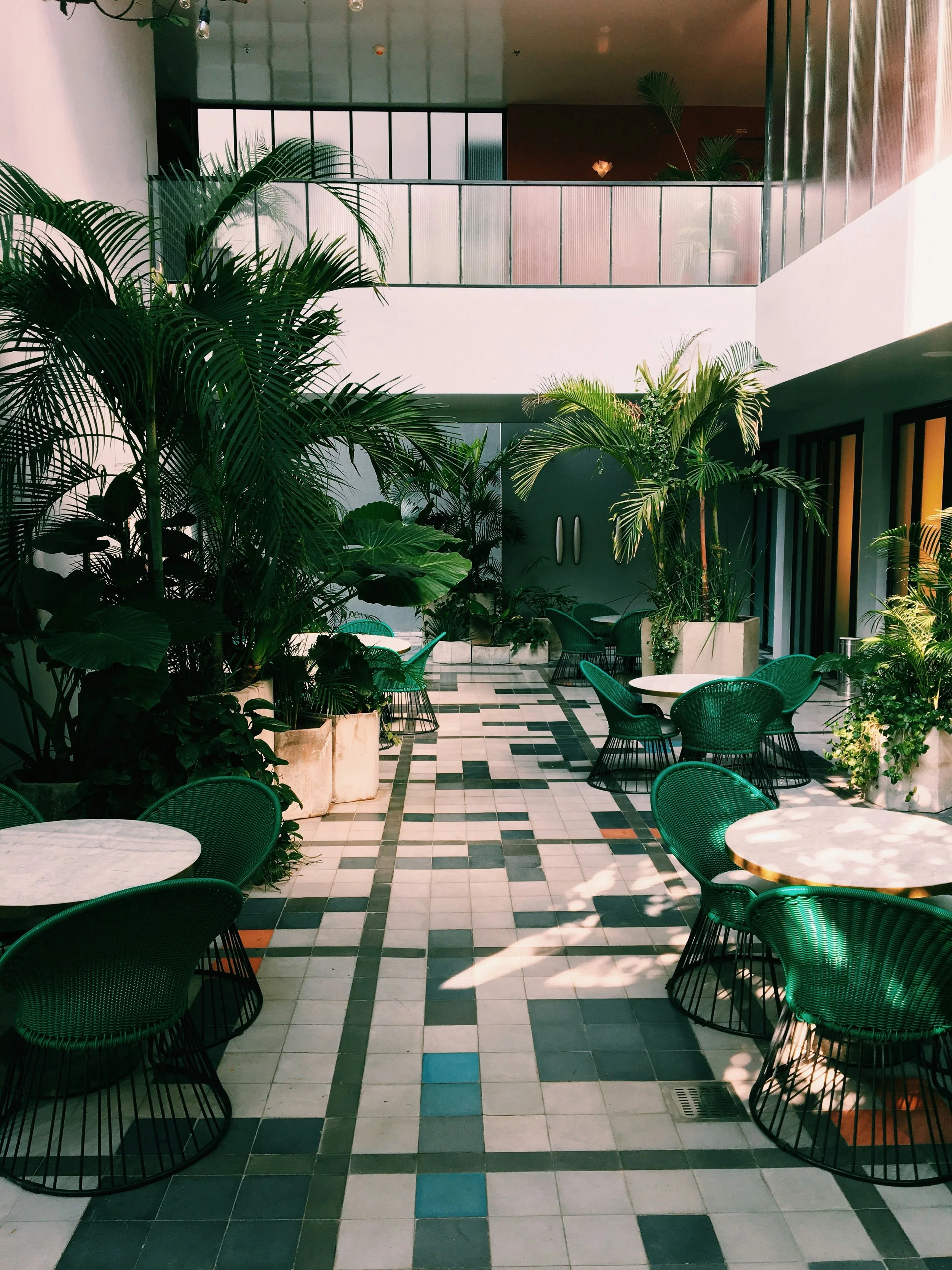
To further drive home the story, I created a mood board that visualized what life would look like at The Netter’s resort. From people interaction to environmental surroundings.
Primary (Color two)

Secondary
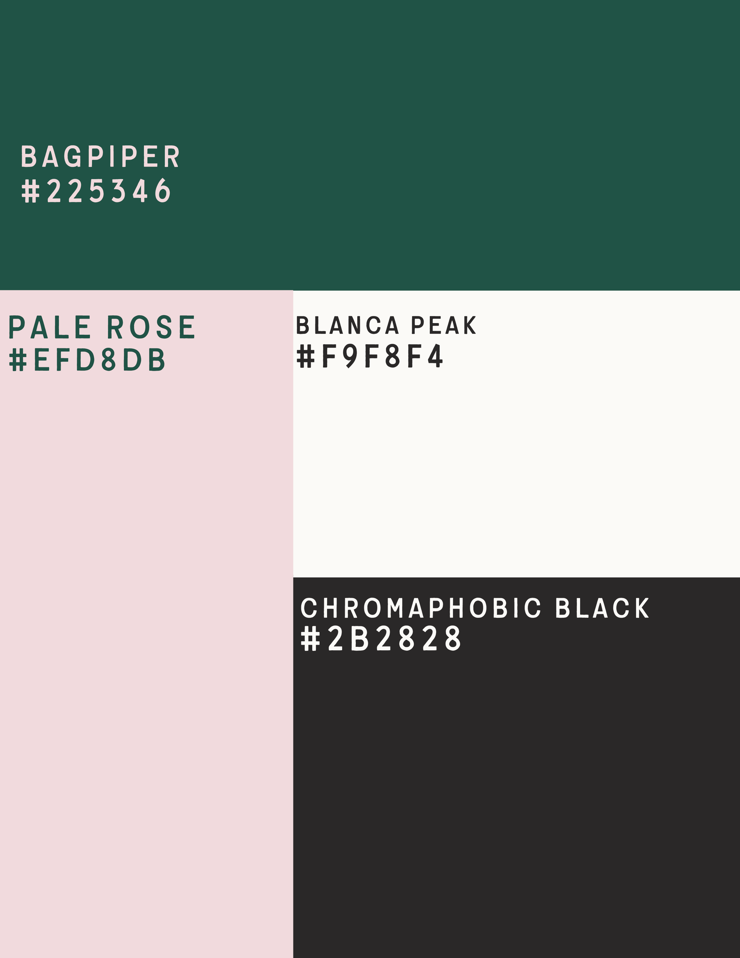
Brand Color Palette
The palette takes a modern approach to traditional tennis colors, pairing rich forest green with soft blush and warm off-white for a look that feels elevated, playful, and timeless.

Custom Icon Set
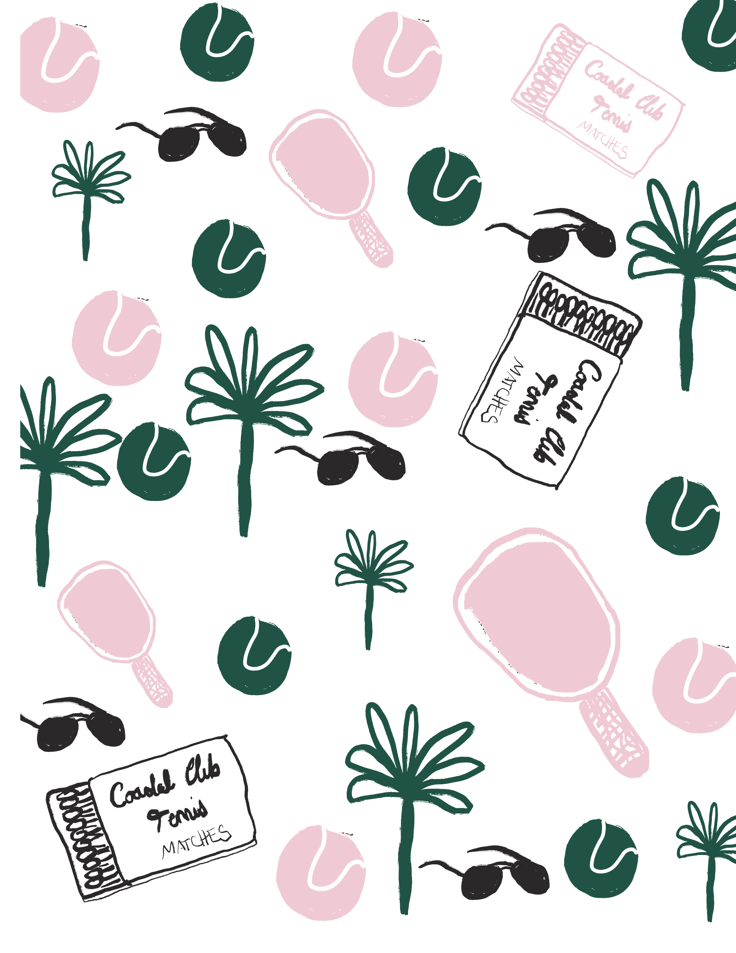
The Netters utilizes a custom icon set that can be found on various stationery and activations.

Social Media Templates
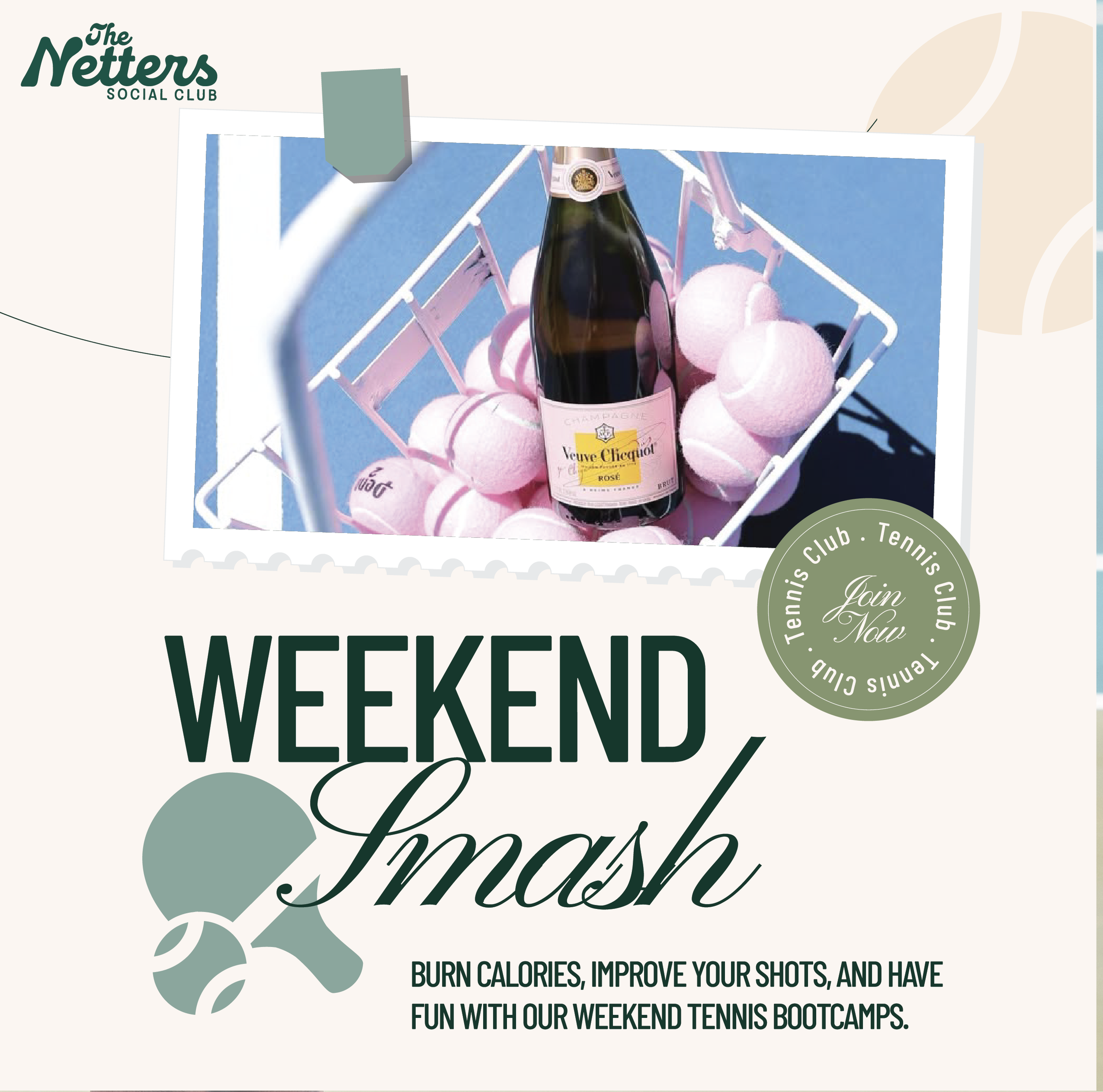
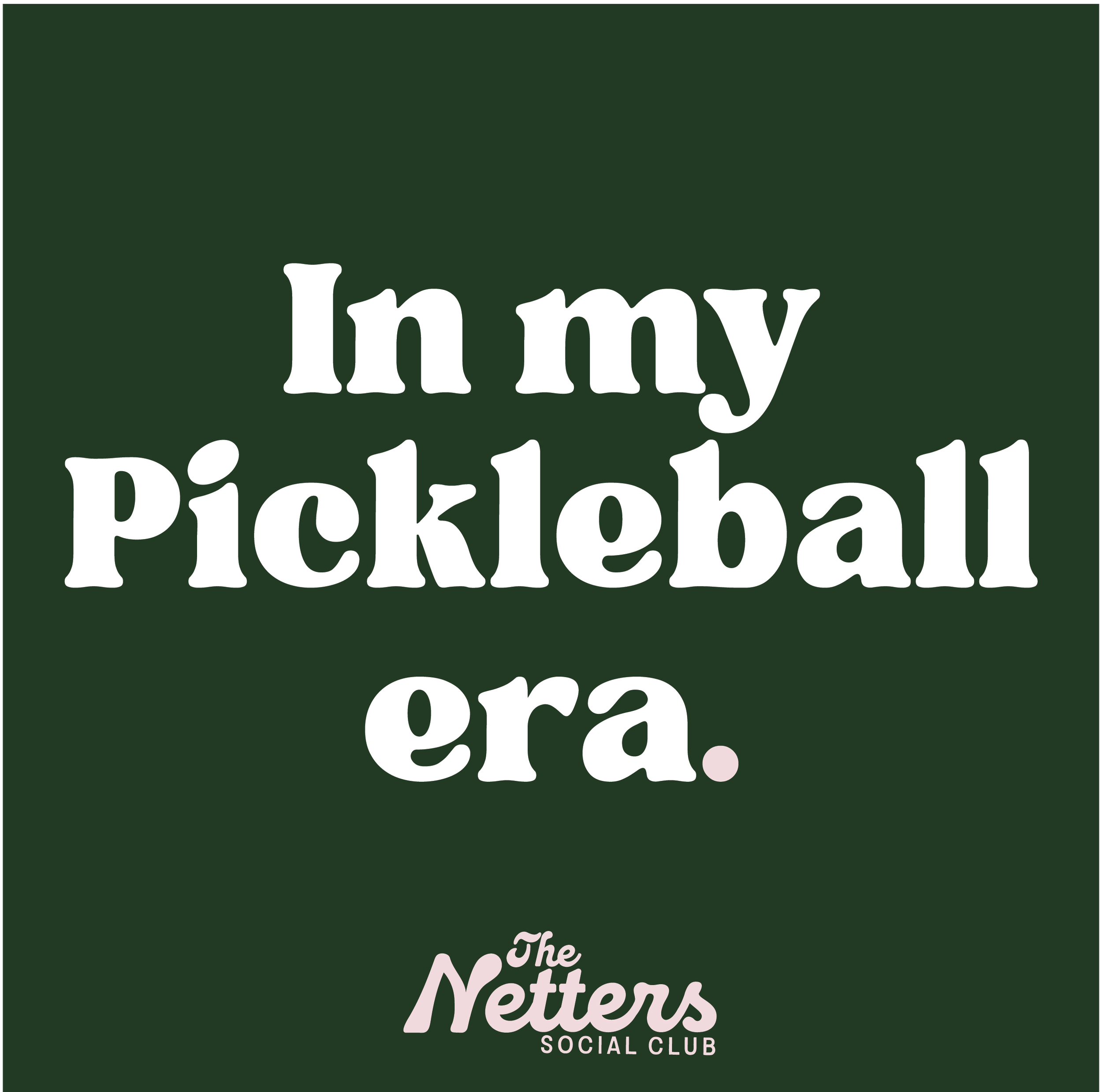
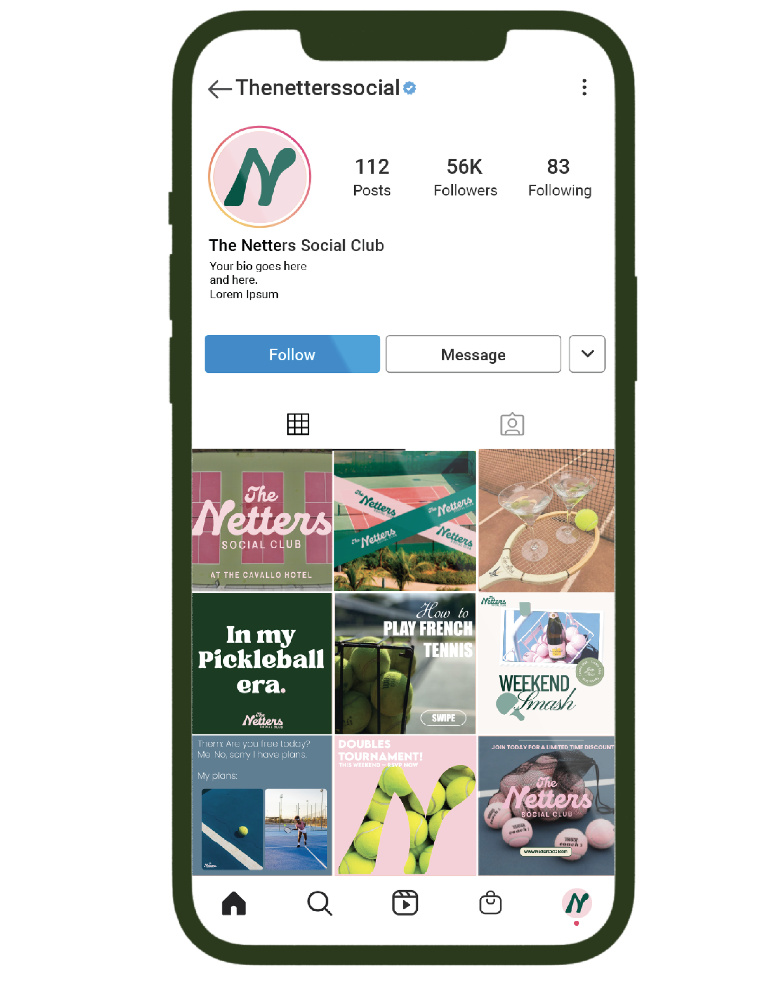
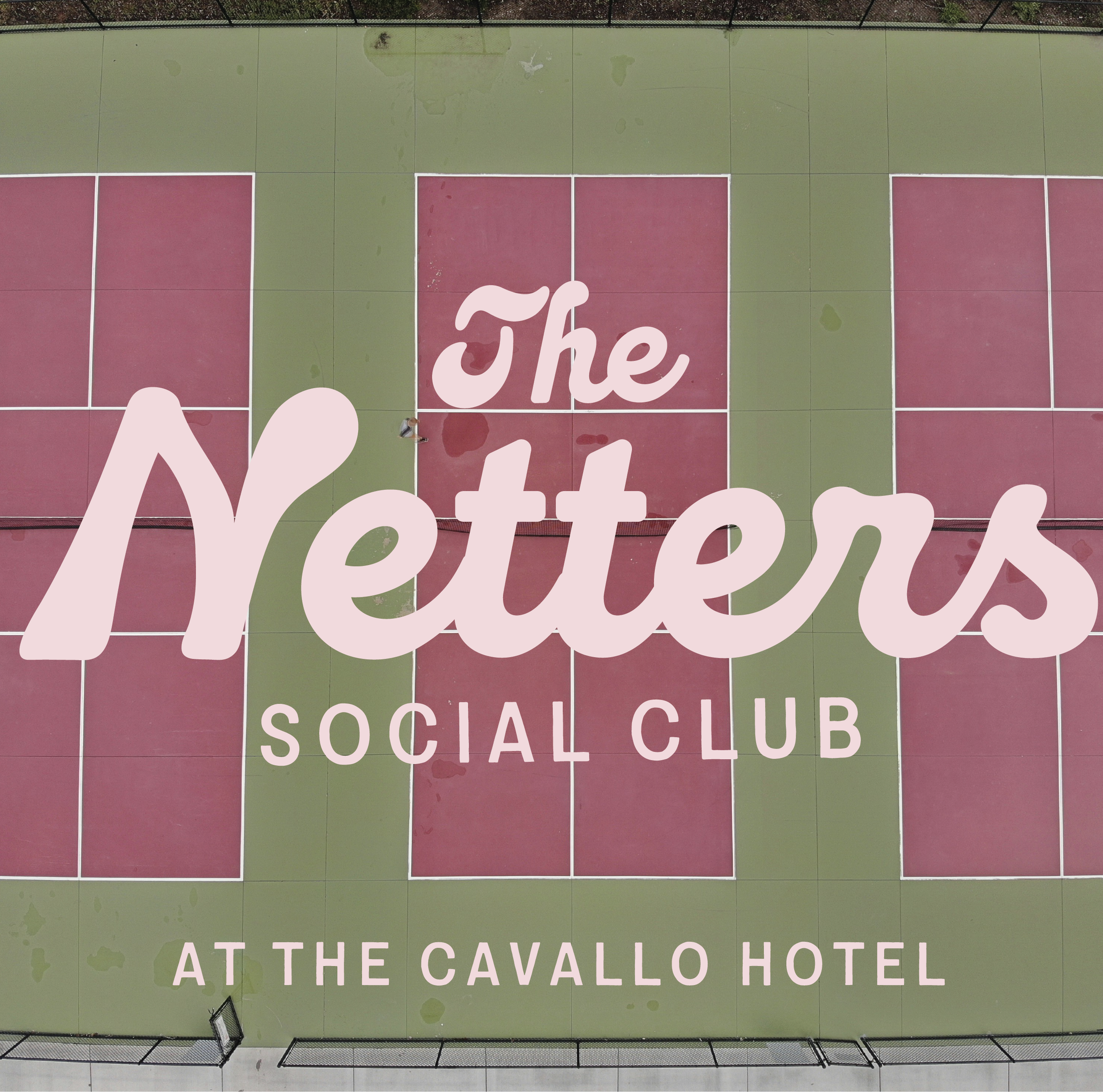
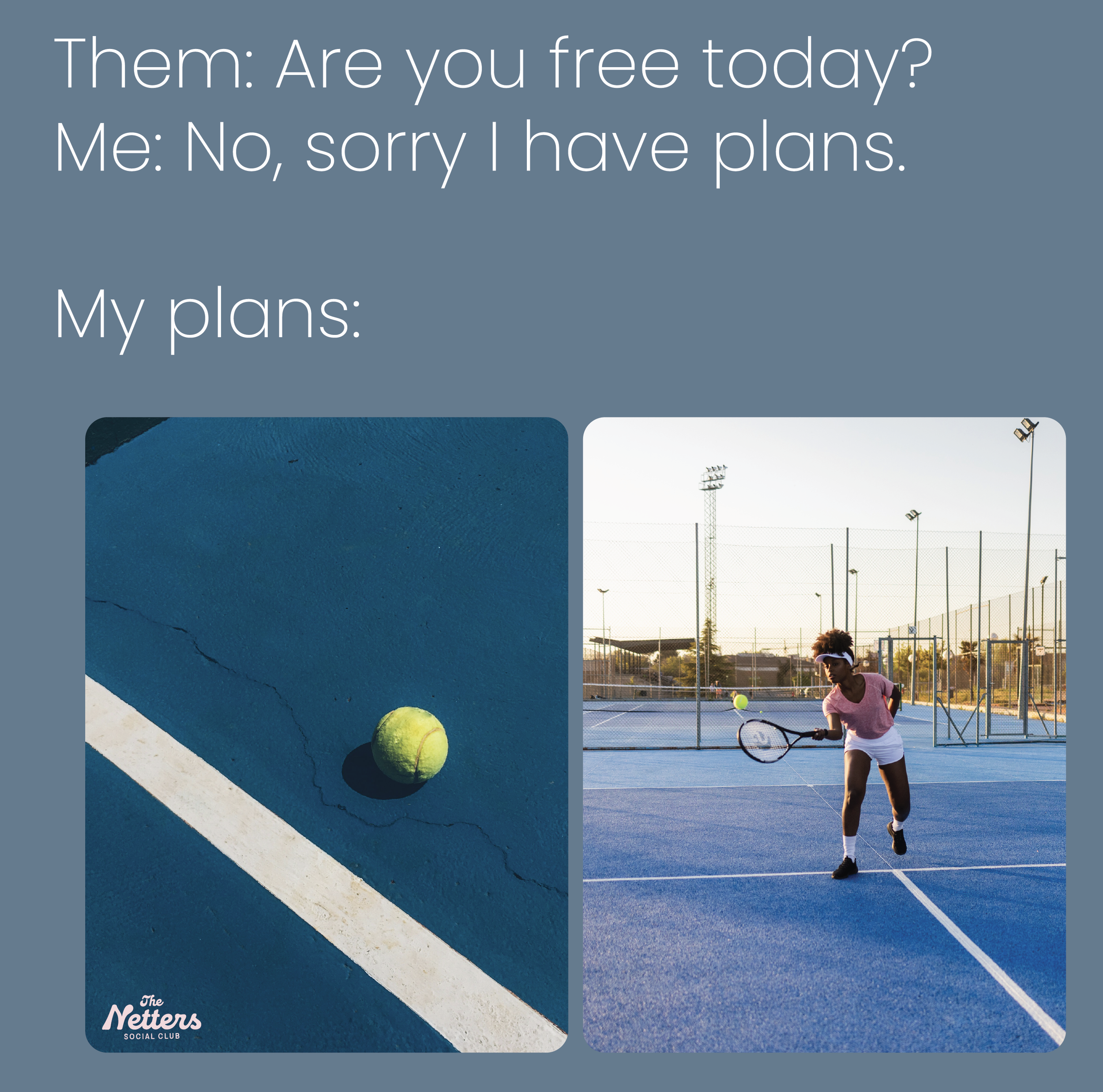
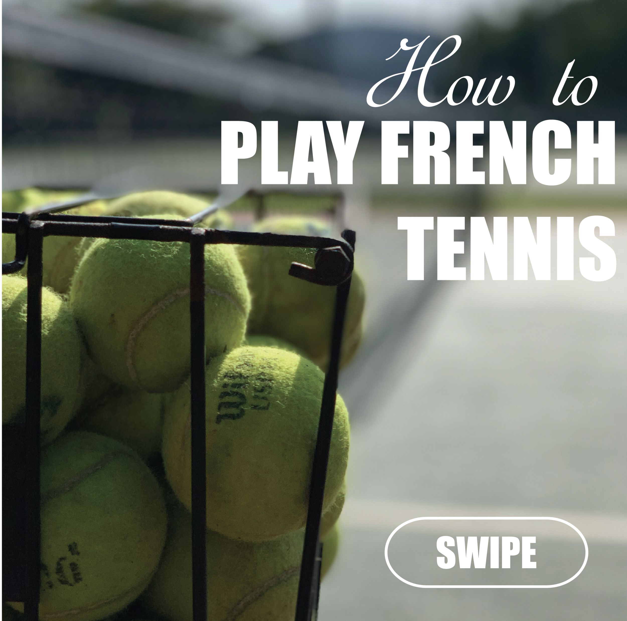
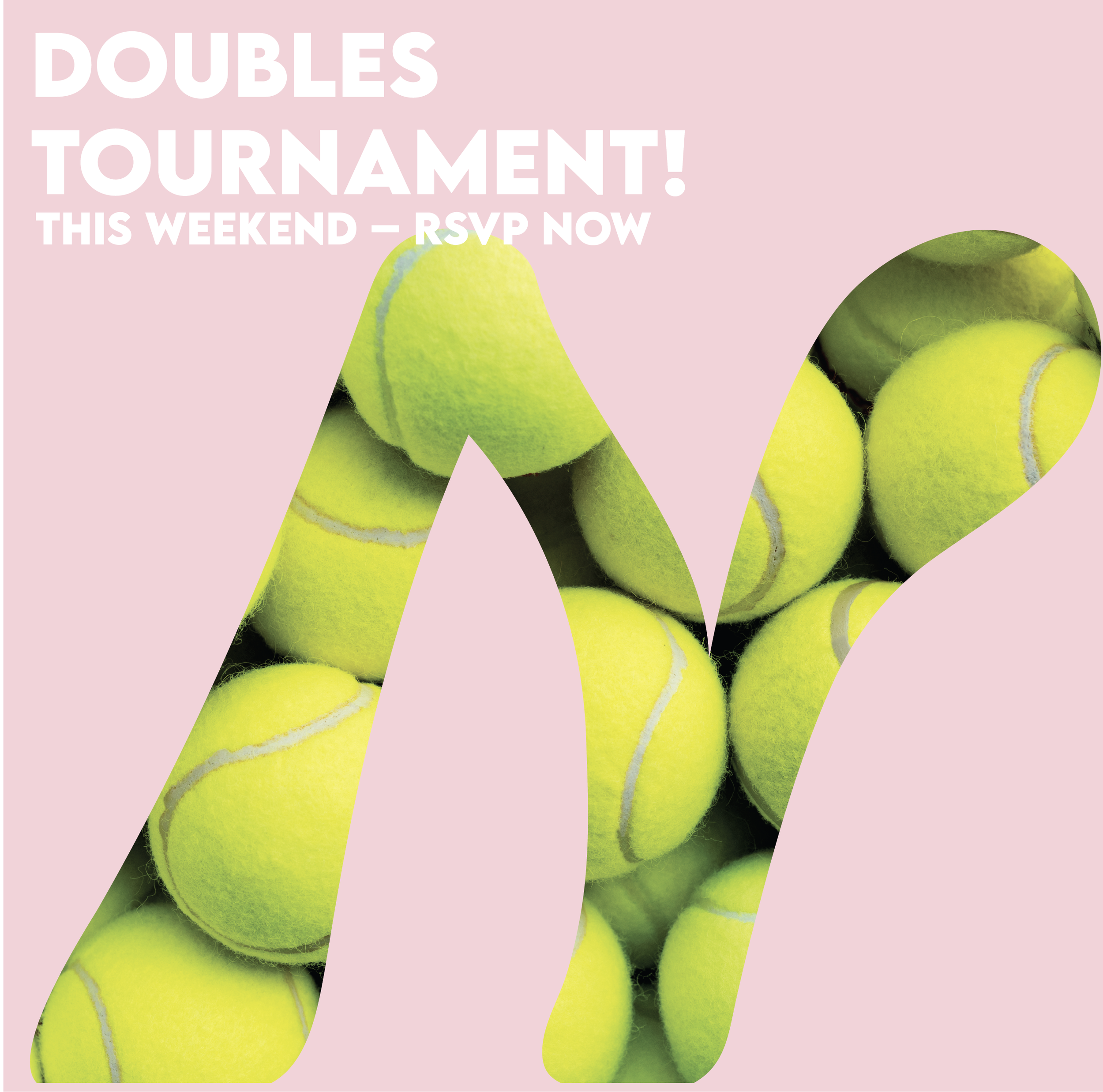
Social media was designed to feel cohesive, interactive, and in tune with current trends. As a primary touchpoint for members and prospective guests, the templates balance brand consistency with relatable, engaging content that keeps the community connected and in the know.
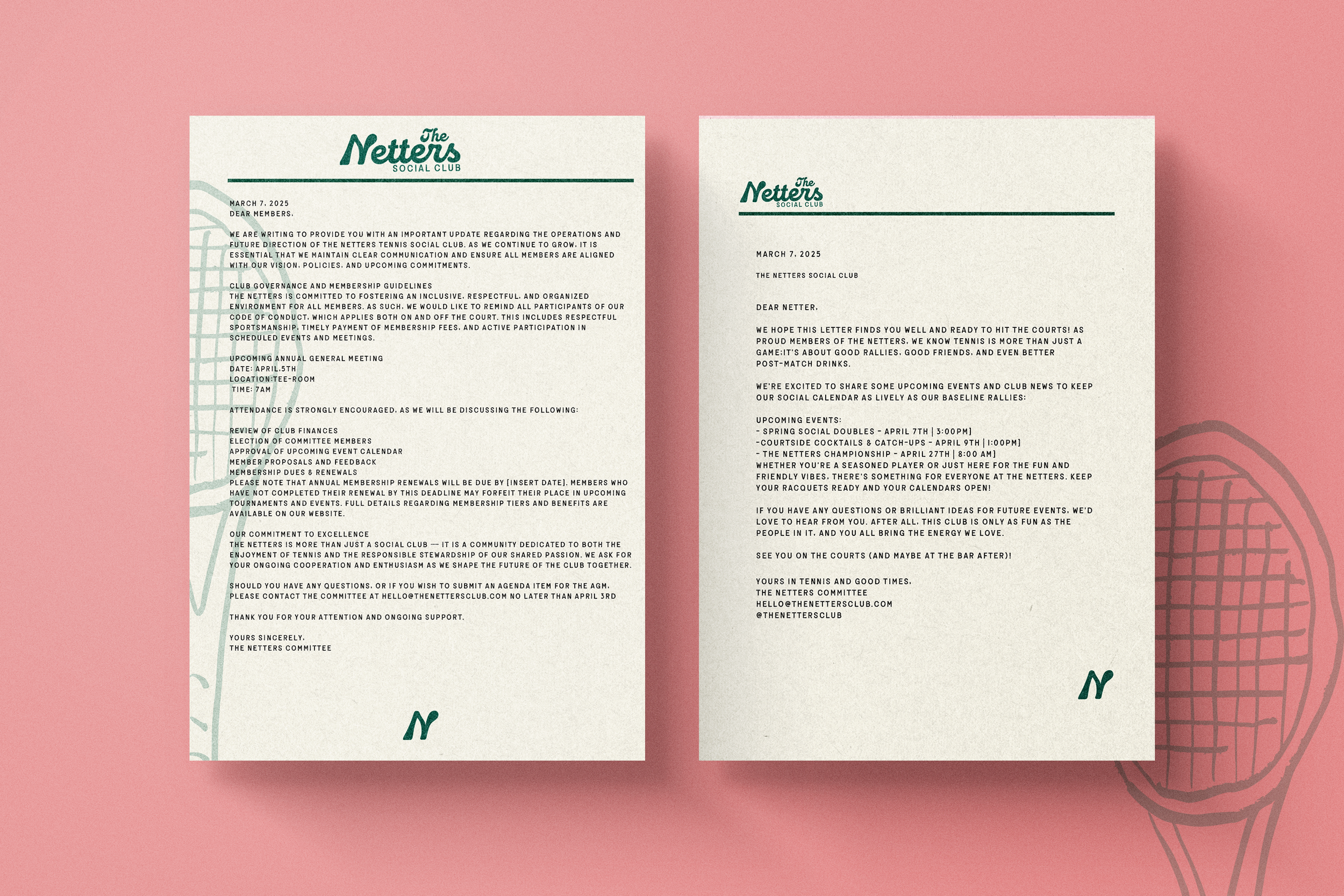
Stationery and Assets
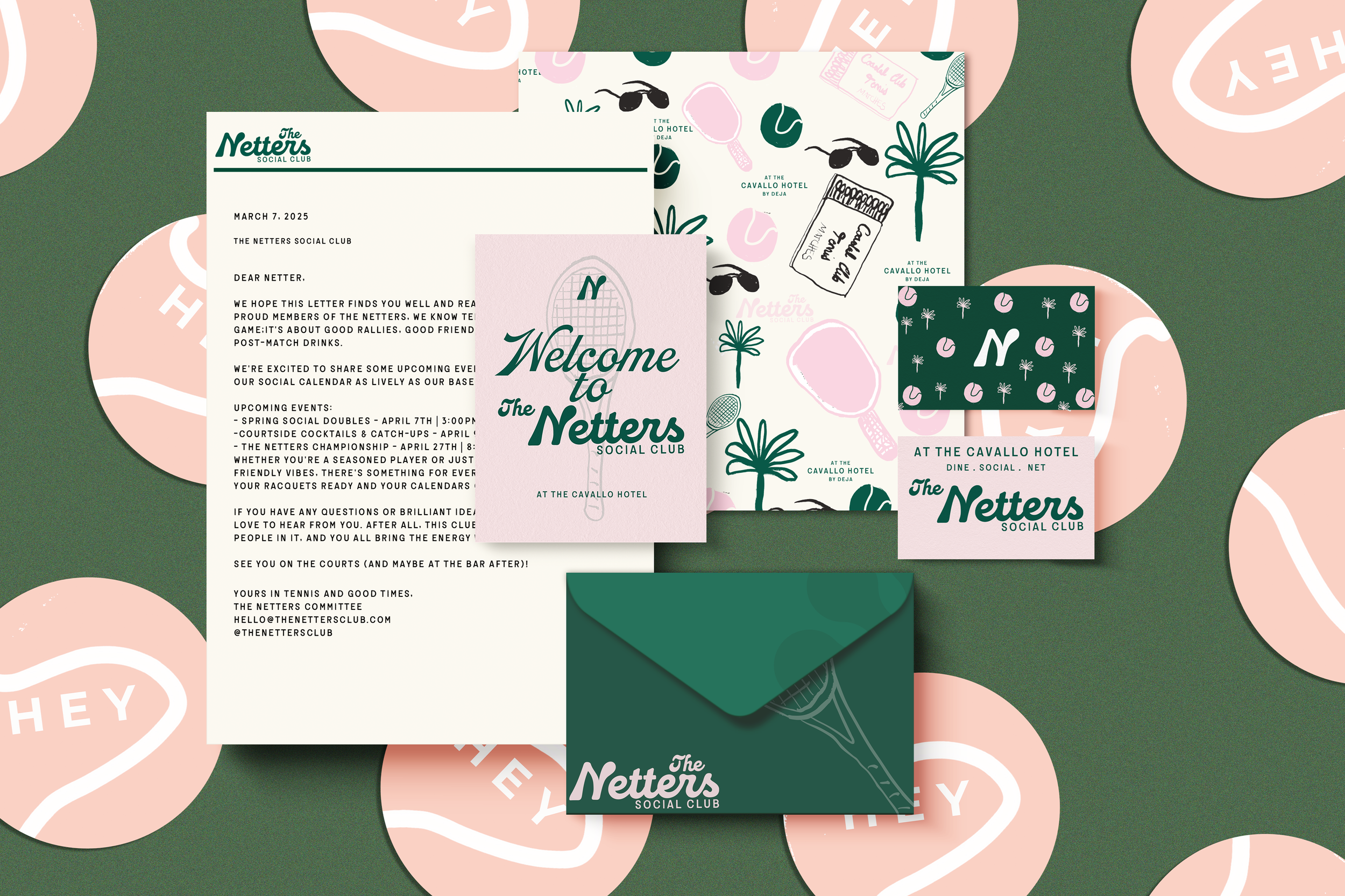
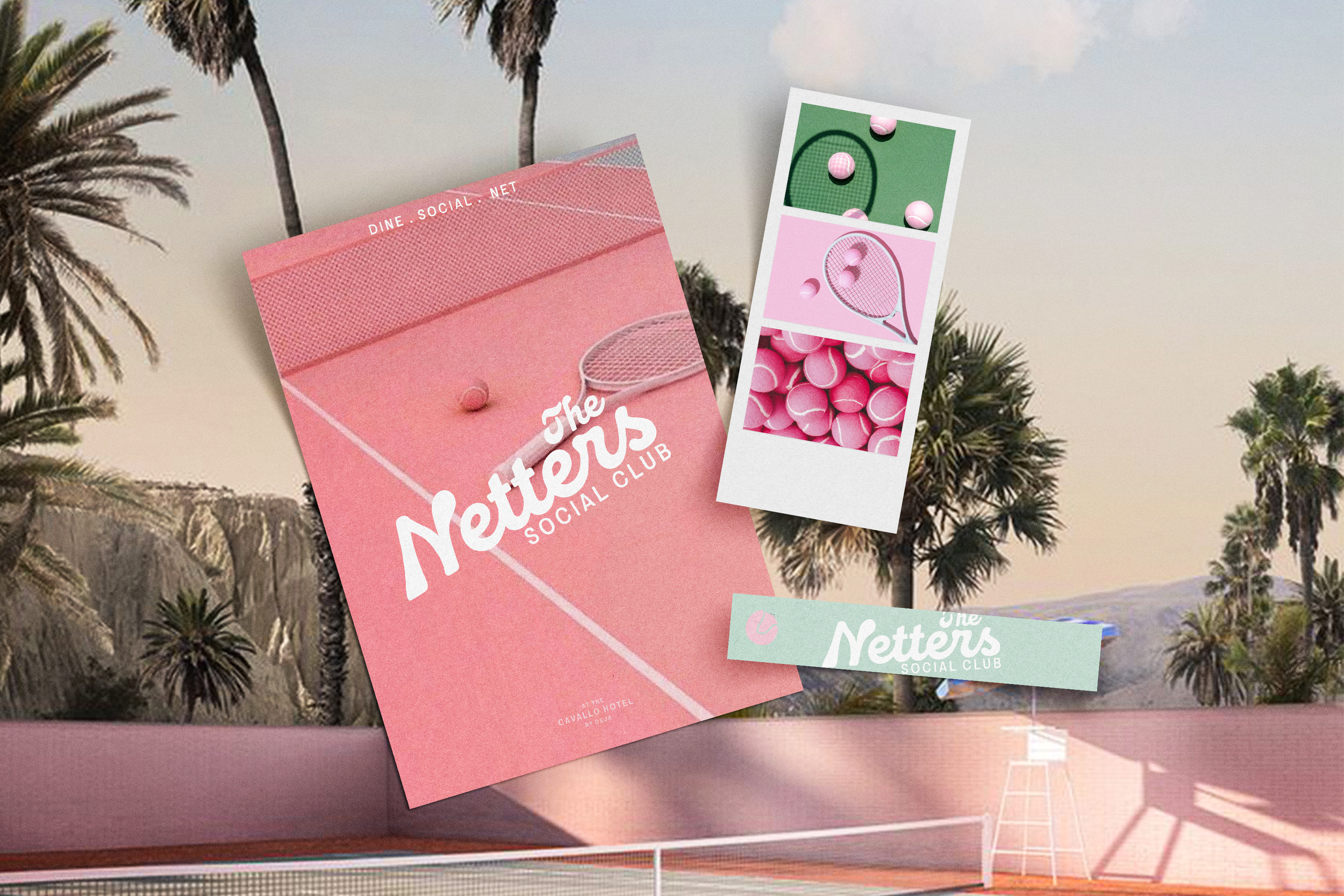
Stationery offers another opportunity to bring the brand into members' everyday lives. I designed each piece to feel cohesive with the visual identity while being functional, memorable, and display-worthy—something members would want to keep on their fridge.
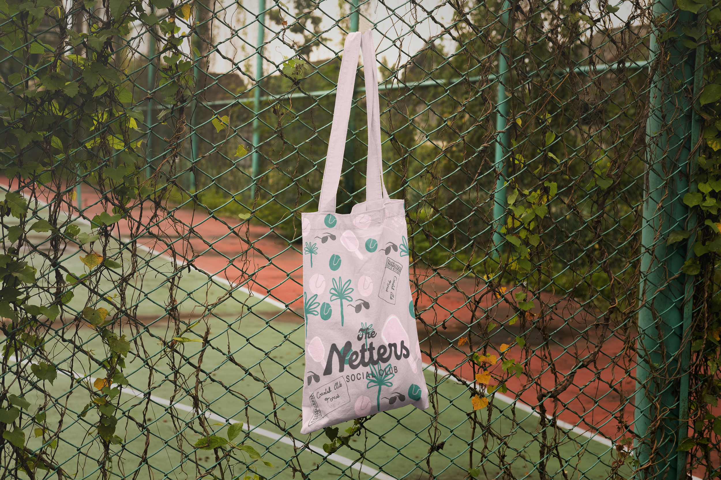
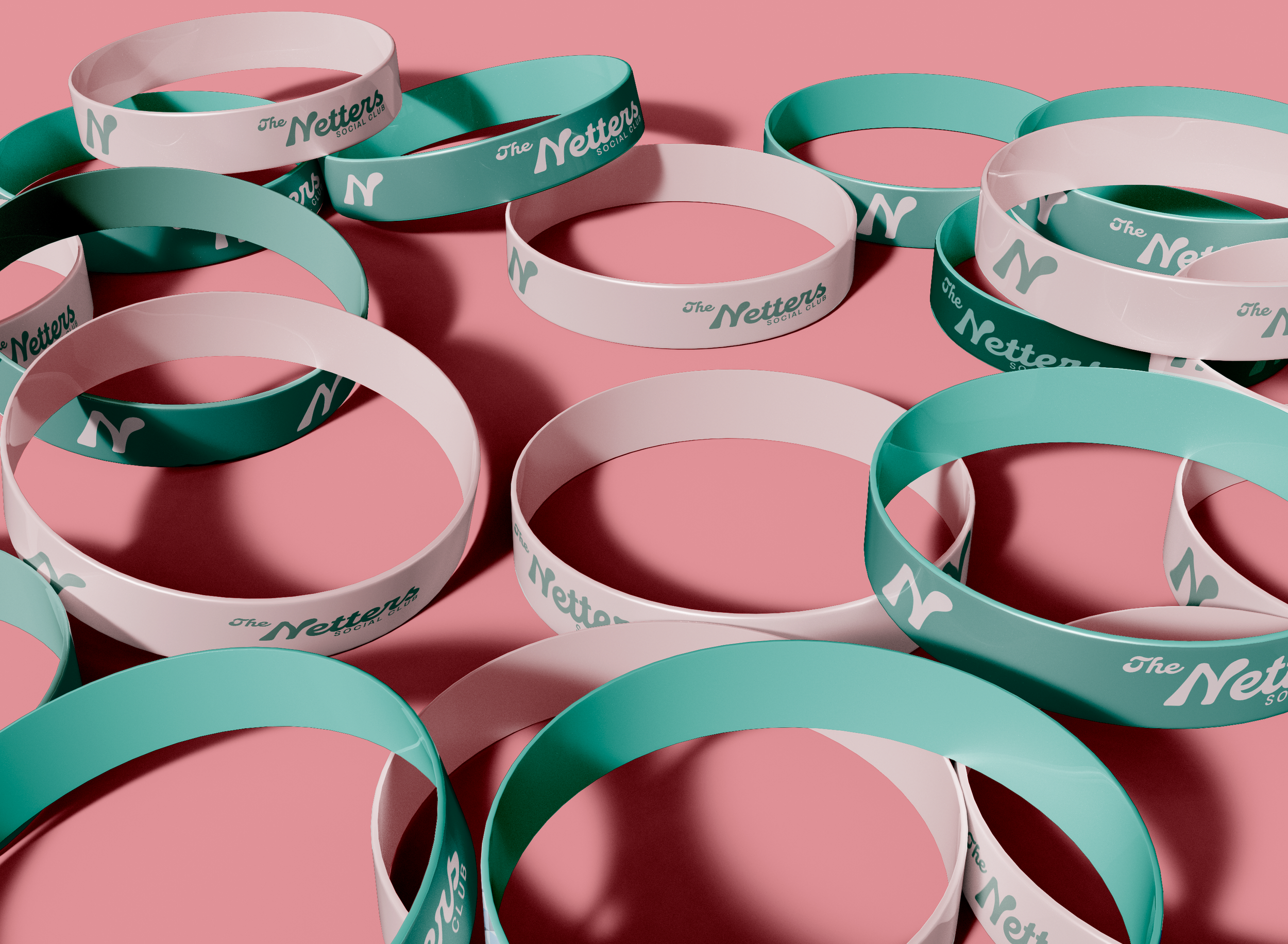
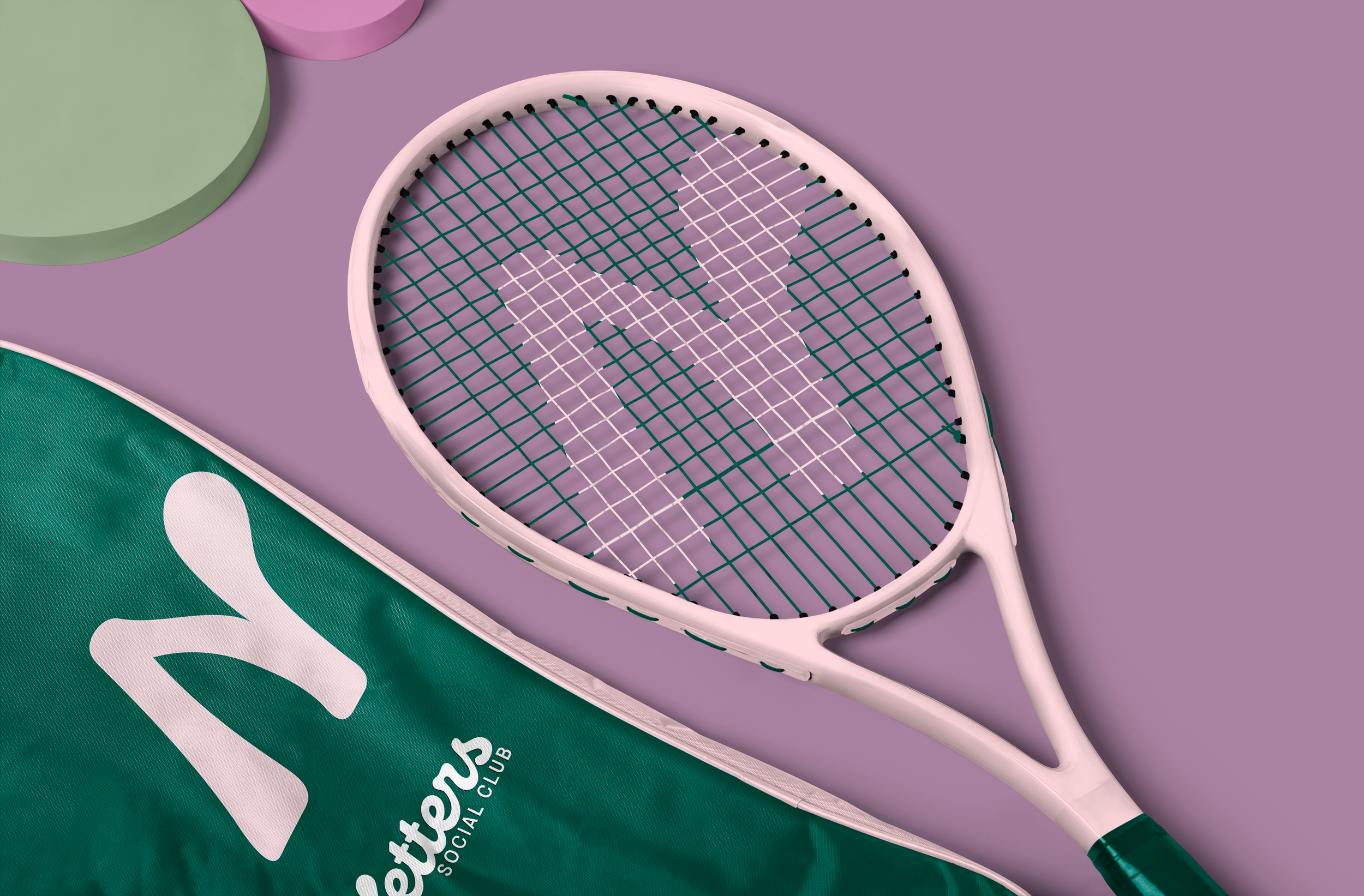
Merch
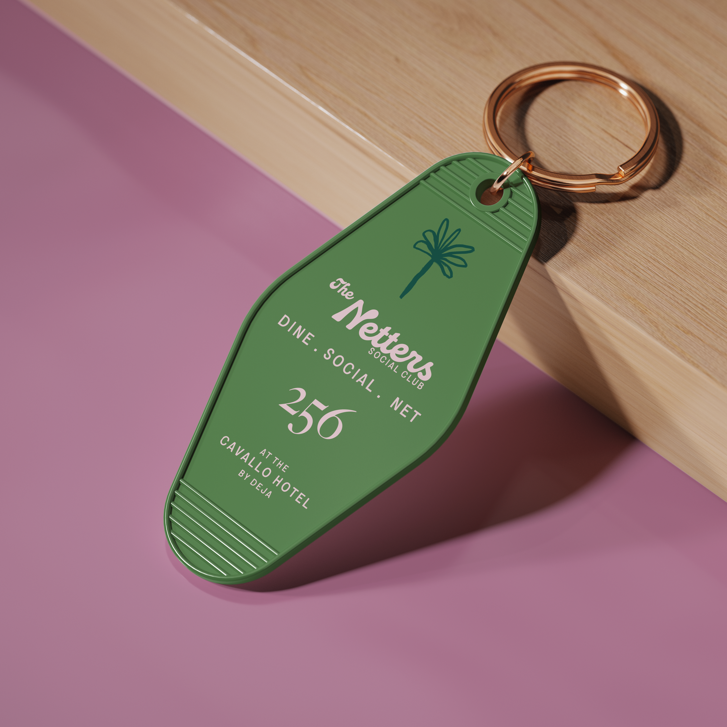
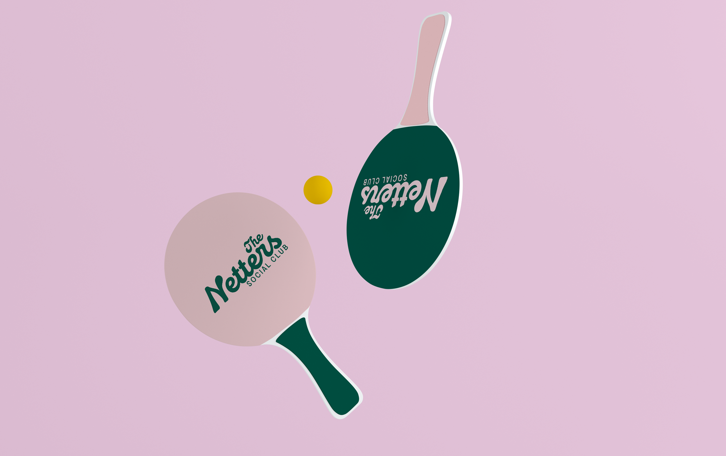
The goal was to create merchandise that fits seamlessly into an active, social lifestyle. From everyday tote bags to branded tennis gear, each piece balances function with style. Smaller accessories like wristbands and keychains offer a more subtle way for members to show their club pride.